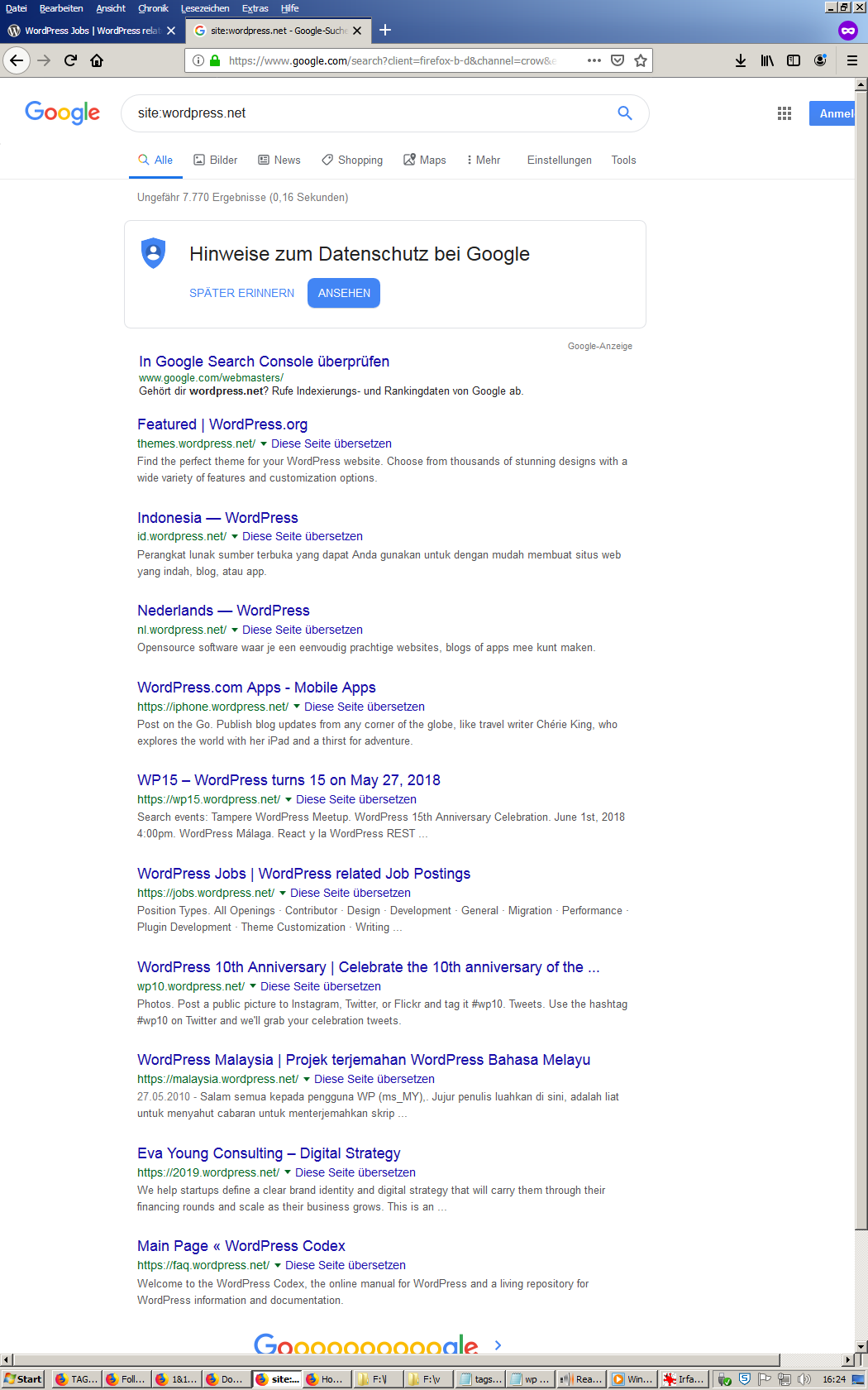
WordPress.COM Reader Design Feedback (about Featured Image & information usability)

I notice WordPress.COM’s “reader” functionality has changed, and I would like to share some “feedback” about it. Please feel free to add any other feedback (if you like — at least related to recent changes in the WordPress Reader).

I notice that the Featured Image (or some image, I guess) is much larger, and therefore more prominent. The reason I notice this most of all is because two other pieces of information are normally far more important to me, namely the blog’s site title and blog post title. These two pieces of information are now separated by SO MUCH screen space that I now sometimes find it difficult to see both the blog title and the post title at the same time. Yet BOTH of these two pieces of information are crucial for my decision to click or not to click — and that really is the question we all need to answer, isn’t it?
Matt Mullenweg’s Answer May Have Been Somewhat Misleading

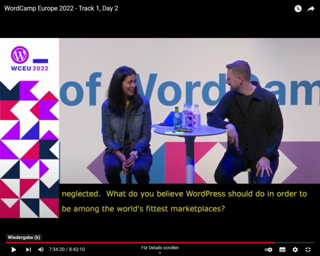
Matt was quite specific in his answer to my question — he specifically focused on WordPress.ORG

Yet he gave this answer from the stage which is a premier focus of many WordPress users’ attention: WordCamp Europe — i.e., WordCamp.ORG

WordCamp Europe had a “LiveStream” — hosted at YouTube.COM

Why would WordPress users be monetised this way — having their data incorporated into Alphabet’s monetisation models? Was it perhaps because Google was the first and foremost sponsor of WordCamp Europe 2022?

WordPress, WordCamp and Google are three distinct marketplaces, but there may indeed be a sort of affiliated network of cross-media promotion, monetisation, advertising and such going on — or is this completely “out of the question“?